

Exa Ride.
A smart electric scooter rental and sharing app that provides hassle free commute all across city through connecting networks.
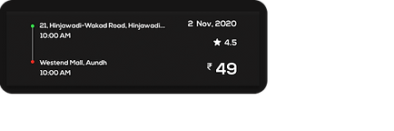
2 Nov, 2020 - 2 Feb, 2021
Why Exa Ride?
Pune has made its mark as the educational epicenter winning itself the sobriquet, ‘The Oxford of the East’. Not just that, it has a growing industrial hinterland, with information technology, engineering and automotive companies in such a scenario the introduction of Exa Ride — smart electric scooter rental and sharing scheme - is win win situation. This is the story of how I made a positive difference to everyday life in Pune. For consumer, we wanted to increase loyalty and retention by providing commute without worrying about maintenance and ownership of the vehicle.
What is Exa Ride?
Exa ride is an electric scooter rental and sharing platform which allows you to commute faster within the city. It is currently available in Pune. Exa ride wanted to capture more of the electric rental scooter market for which we designed a membership program as well as modification in existing app. Users get the benefit of having monthly, weekly or daily rental membership and monthly pass.
Project Brief
Introduce Exa Ride with rental membership and monthly pass including modification in existing app. Create a classy end-to-end experience for exa ride users. Users should be able to easily access rental platform with their preference. We have initially launched Exa Ride in Pune, India and will be expanding soon to other cities.
My Role
As an UI-UX Design intern, I was responsible for:
+ User Research
+ Wireframing
+ Information Architecture
+ User Interface and Visual Design
+ Prototyping
+ Testing
Design Process

Understand
+ Manager Need
+ Market Need
+ Competitor

Research
+ Observation
+ Interviews
+ Survey
+ Competitor Study

Define
+ Persona
+ Product Principle
+ Information Architecture
+ User Flow

Design
+ High Fidelity
Wireframe UIs
+ Prototype

Test
+ Usability testing
1. Understand
"" Learning about the problem ""
What I Did?
Being the first & only UI-UX Designer in the team.
However, the CEO was not sure what I can do for them, as their product is already designed and is under a development process, but he expected me to find some usability issues in the app to improve and implement some new features and schemes.
Since the app is already designed by the senior transportation design lead, I also need to communicate with him a lot to to make changes in the design. So, we planned to conduct user research again to improve the usability of app.
+ Understand the market thoroughly by downloading all-related apps and analysed their usability.
+ Sit down with decision makers (CEO, Design Lead) and ask them to prioritise our design needs.
+ Interview with different roles to understand everyone’s expectation on the product and their priorities.
+ Do more user researches to convince CEO and Design Lead.
First Challenge:
Internal interview with 5 employee :
Being the first designer in the team, I believe I am also responsible for bringing that UX mindset to the team. As a result, I scheduled a few interviews with different positions in the team to seek for their expectation on the product. These interviews help me to build a better bridge between the stakeholders and the product.

CEO needs -
+ Higher visibility on the market
+ More reputation of brand in the market
+ Attractive brand image

Design Lead needs -
+ To get more functions to fit users need
+ User guide to learn about how to use particular interface
and what is next to be performed

Developer needs -
+ Error Handling via customer feedback
+ gradual change in design
+ Keeping standard way of detecting location

Marketer needs -
+ Deeper understand on customer
+ Shorter onboarding process
+ More ways to increase retention rate
2. Research
While researching we saw a boom in rental scooter market. Since this was the first ever rental membership and monthly pass plan exa ride was coming up with, it was important for us to look at some of the most popular rental membership and pass plan across geographic like Bounce, Vogo, Rapido, Yulu etc. We looked at their product flow, understand the primary objectives and noticed how they hook users on to their product.
Then, we brainstormed how to design the experience of buying a rental membership and monthly pass for easy access of ride. We held a small card sorting exercise within our team to understand the user expectations and needs. This exercise helped us to understand the kind of questions a customer might have while buying rental membership and monthly pass.
"" Looking bigger picture ""
What I Did?
+ Conduct user interviews to get wider pictures of their expectations.
+ Sit down with other employees and discuss strategy to bring UX mindset in company.
+ User interviews and survey to see picture from user's side.
Competitor Analysis:
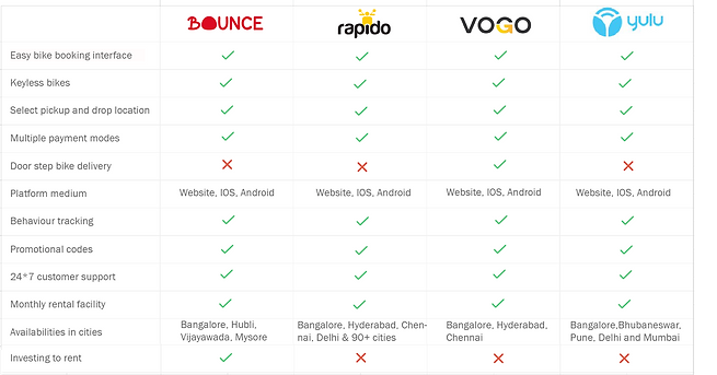
What I learn?
Looking into competitor research from several rental scooter app and white papers I was able to identify recent trends and patterns in rental scooter market. Some notable insights marked is :
+ Users combining Leisure ride and ride for everyday use.
+ People looking for book rides for longer time span.
+ User are looking for making income out of taken ride while not is use.
Insights from survey and interviews :
I conducted user survey at Hinjewadi area, Pune and around 40 interviews of existing users to get feedback from existing app and their requirements.
+ Daily users are irritated by performing the entire searching, booking and payment process.
+ People are looking for long term booking plans.
+ User are looking for more playful interface for start and stop ride.
+ User guide for approaching the functions in app.
+ User want to select vehicle by seeing pictures.
+ Graphic elements and icons conveys message easily and user can connect more with pictorial representation.
3. Define
Based on our research, user persona is framed from real customer discovery and researching the needs, goals, and observed behavioral patterns of a target audience. We recognised that there were 3 key user types that our product tried to solve problems for. The scenario in which they are approaching Exa Ride has different purpose. We tried to gathered their requirements and decided to come up with some new features and some modifications in existing app.
"" Building foundation ""
What I Did?
+ Framed user persona to gain valuable insights and make decisions based on users needs.
+ Created Information architecture to support usability and findability.
+ Defined user flow that takes them from their entry point through a set of steps towards a successful
outcome and final action, such as selecting and purchasing a product.
+ Defined product principle to make better decision in terms of design.
User Persona :
Based on our research we defined 3 personas for gauging the effectiveness of functional UX design through the eyes of a user. To grow and improve a business, it is important to uncover the different ways people search for, buy, and use products, so we can focus our efforts on improving the experience for real people through real data.


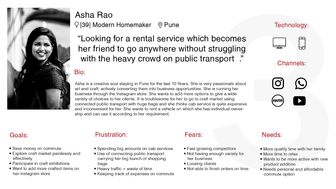
What I observed ?
After gaining insights from user persona I observed several needs of users :
+ Users are looking for more reliable and affordable commute service.
+ User want to have one time payment method and experience of temporary ownership.
+ Clear and more engaging interface for keyless drive.
+ Easy understanding for approaching next action.
Product Principle :
Keeping all the value proposition in mind, we listed down some key principles which defined Exa ride as a product and helped us make better design decision. Some of the principles are as follows:
+ Create a rental membership and monthly pass experience which feels exclusive and classy
+ Build a feeling of trust in user's mind, that they are investing in a good product and it will be of great value.
+ Ensure clear and straight forward communication about the product.
+ Make it easy for users to discover Exa ride rentals.
+ Make the process of redeeming the Exa ride journey easy for users.
Information Architecture :
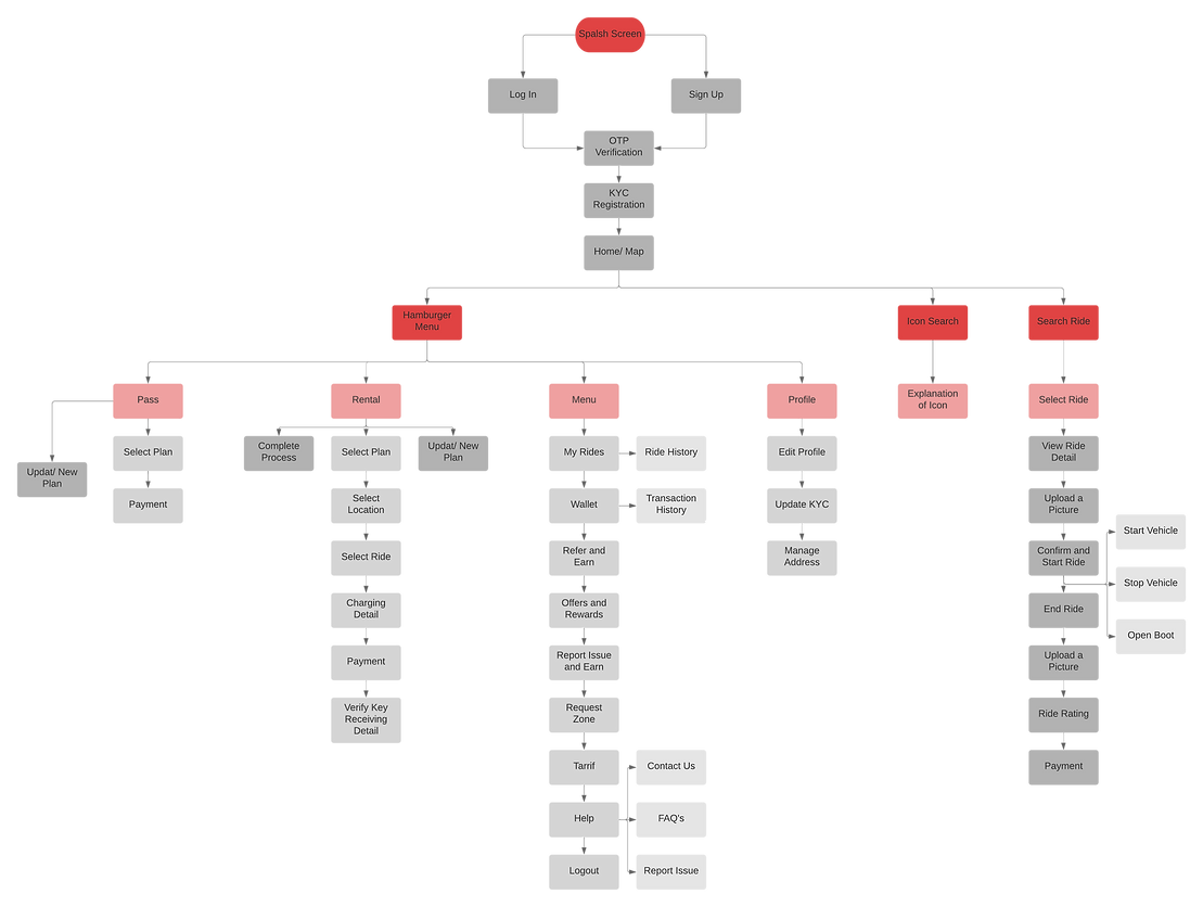
We started to flesh out the basic idea with the help of defining user flow, to get clarity about how exa rental membership and pass plan can be bought and make the commute easy. After diving deep into the user requirements, we figured out the core scenarios of how the basic flow of app, rental membership and pass will be used. By the end of this exercise we had a user flow ready with 4 major direction: We created wire flow to make UX even more effective by harnessing the power of wireframe and flowchart, creating a step-based UX diagram that illustrates the steps and decision points of particular scenarios and the possible navigation paths throughout these steps.
Wire Flow :
Flow 1 : Log-in / Sign up and KYC registration

Flow 2 : Select, Connect, Start and Stop ride
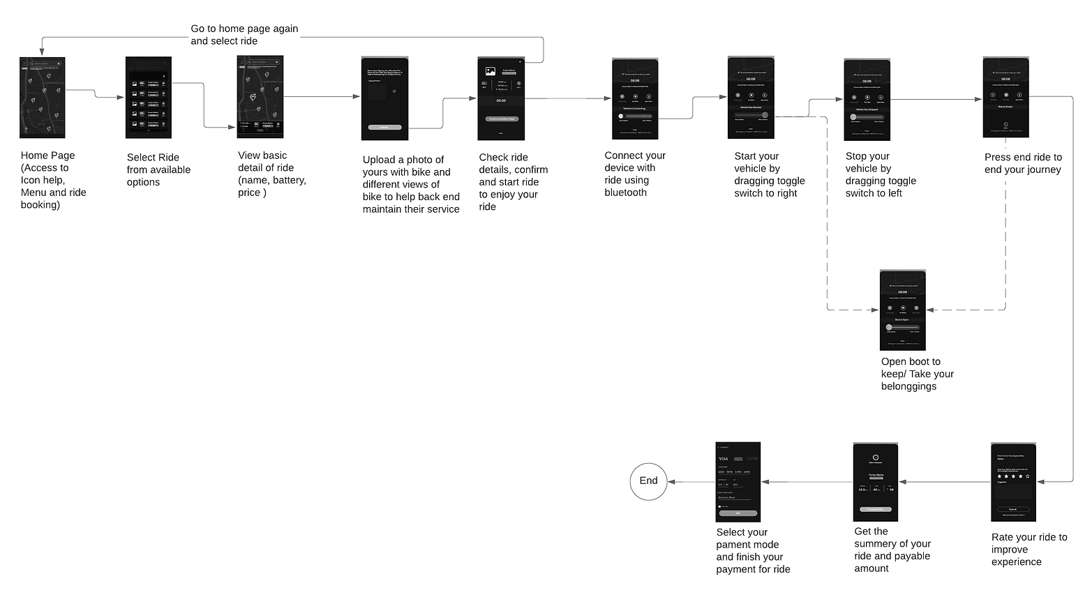
Flow 3 : Take steps towards enjoy journey via rental membership and pass scheme

Flow 4 : Take actions from menu options

4. Design
To improve a design’s/product’s aesthetic appeal and usability with suitable images, typography, space, layout and color, we came up with visual design.
Being a first UI-UX Designer in the company, I have taken initiative to generate UI Library for them which can be referred in future.
We kept the color scheme same as before defined by company but tried to add/ change some of UI elements to add more value in the experience.
"" Let it Breathe ""
What I Did?
+ Created UI kit for future reference.
+ Add/ Change UI elements to enhance the visual appeal.
+ Added new features with clarity and easy guiding flow.
+ Design that lead user's eye to an item's functionality with aesthetic consistency.
A Visual Library - Collection of typography, UI elements, Icons and color pallet
Font Style
Nexa
Bold Regular Light
AaBbCcDdEeFfGgHhIiJjKkLlMmNnOoPpQqRrSsTtUuVvWwXxYyZz
Nexa
Bold Regular Light
AaBbCcDdEeFfGgHhIiJjKkLlMmNnOoPpQqRrSsTtUuVvWwXxYyZz
Nexa
Bold Regular Light
AaBbCcDdEeFfGgHhIiJjKkLlMmNnOoPpQqRrSsTtUuVvWwXxYyZz
Color Pallet
#161515
#FFFFFF
#ED0E0E
#EED70A
#08D735
#6A3FE2
UI Elements


Icons


A Visual Design - Let it come to reality
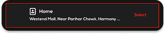
New Features added to App: Rental membership and Pass System
From insights gathered by user research, we added Rental membership and pass system to system for making everyday commute hassle free. The Benefits users will get from this are :
+ Easy booking
+ No more waiting for availability of ride
+ Save on money with plans
+ Save time
+ Feeling of temporary ownership
+ One time payment
Get the notification label for completing your process further
Get notify about the status of rental and pass scheme
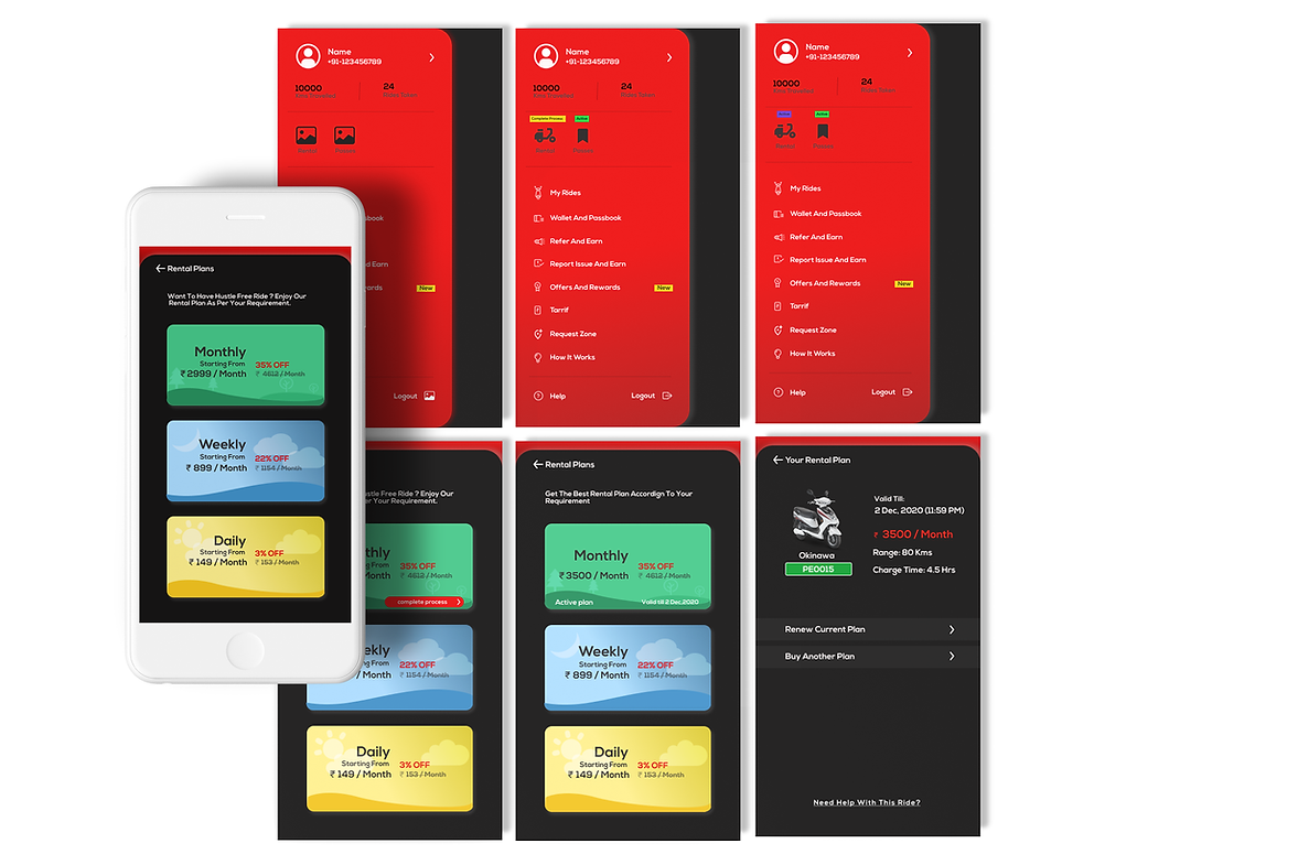
Select Rental pass as per your requirement
Selected pass will guide further to finish your process
Check your plan validity on your booked pass
Take action for new plan
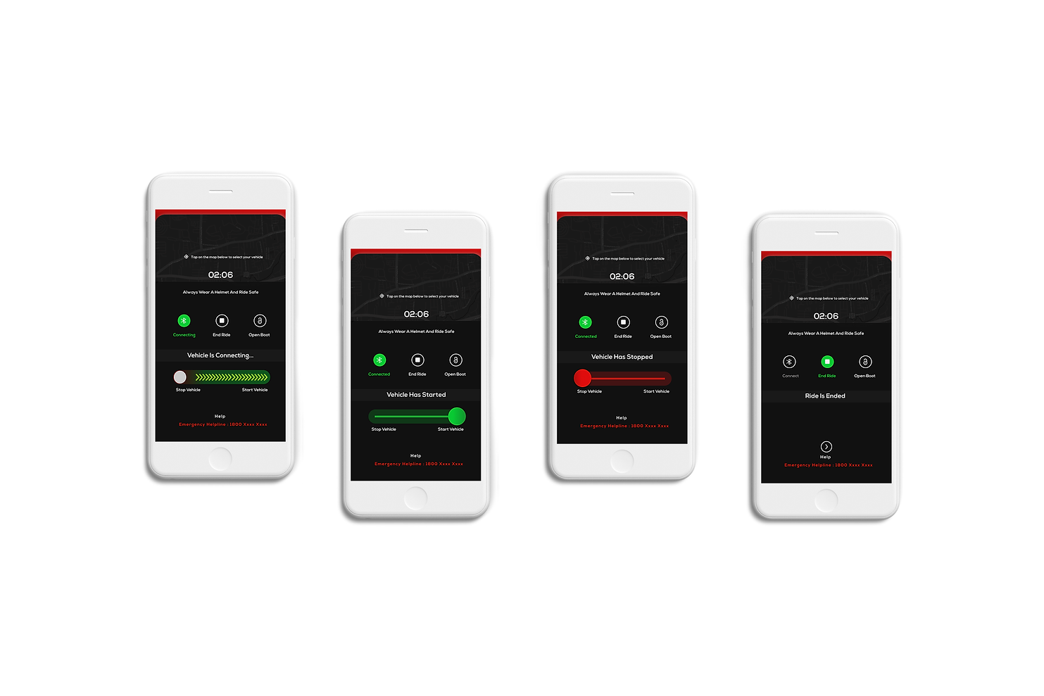
Change in existing design :
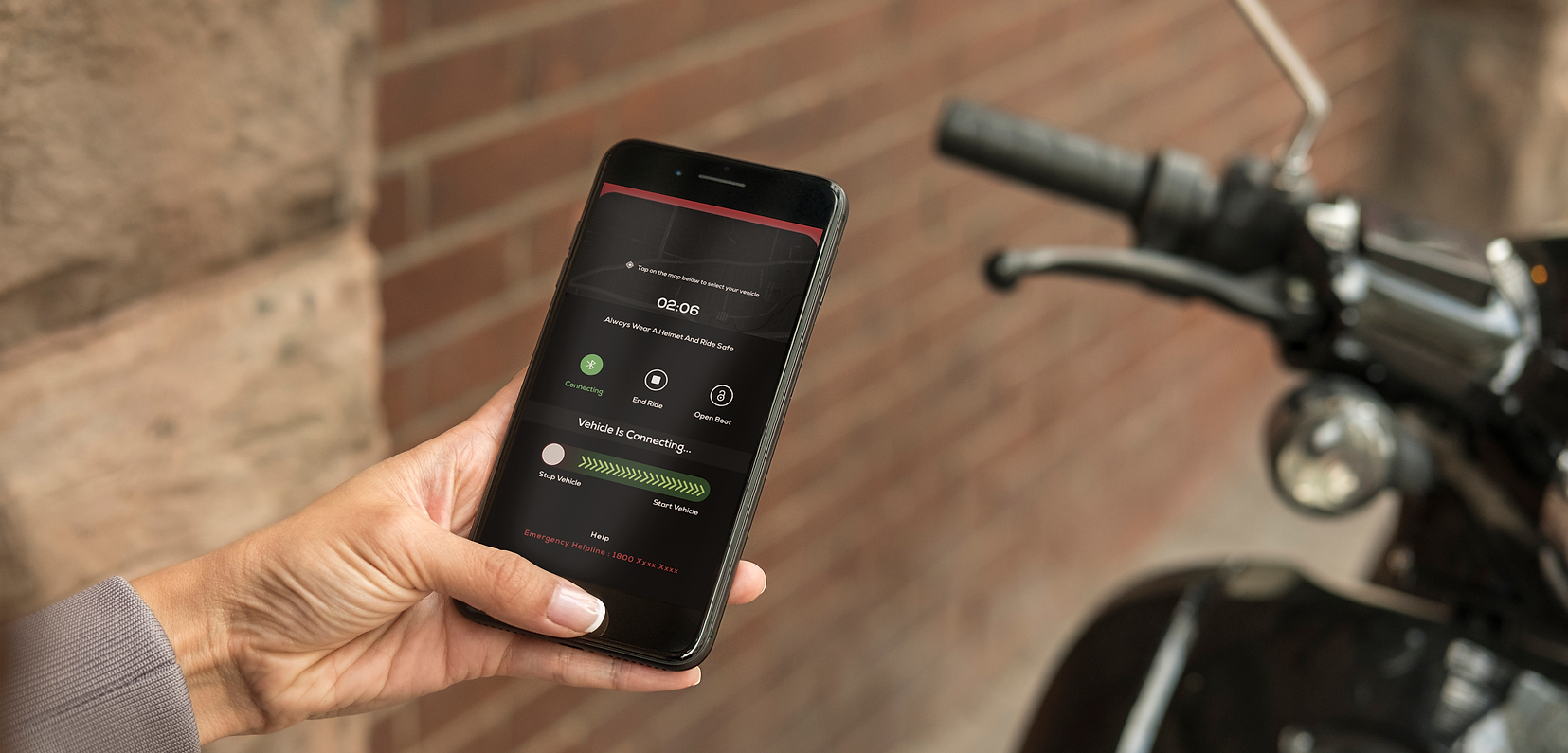
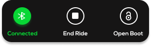
Connect - Start - Stop - End your ride with playful experience
What I did ?
+ Instead of big buttons - taking unnecessary space, I replaced them with toggle switch which
gives feel of action - start and stop.
+ Added status of vehicle to give clear instruction.
+ All the actions needed while riding - keep it accessible throughout the journey


Before :
End your ride by tapping end ride button. You can open boot anytime during journey.
Connect to Bluetooth by tapping connect button
Swipe your toggle switch to right to start your vehicle
Swipe your toggle switch to left to stop your vehicle
Change in existing design :
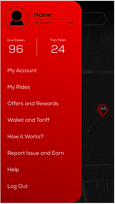
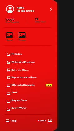
Hamburger menu
What I did ?
+ As icons are are easily recognizable and easy to communicate, I have added icons for
options available in menu bar which ended up getting great response from user.
+ Added a horizontal sliding bar for showing new plans added to the system.
+ Added new label to represent some fresh freatures.
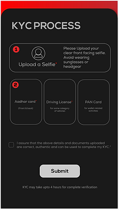
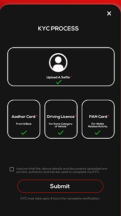
KYC Process
What I did ?
+ After Finishing KYC process, It was hard to know whether documents are uploaded or not.
To solve this problem, I have added right sign after uploading document to make user
understand about the status of document.
+ Change the design of button to blend with rest of design.
+ Played with composition a bit to balance it visually.
+ Users enjoyed new interaction of connecting vehicle with toggle switch as it gives them feeling of
controlling their vehicle.
+ Appreciation for adding icons to menu options which makes them conveying message clearly.
+ They get clear understanding about the status of uploaded documents for KYC.
+ Entire interaction with small details make the entire experience smooth and clear.
Reviews from user : ( No of users - 55)
"" Scope of improvement ""
First stage user testing we did within company with different employees. In second stage testing we asked existing customer to describe the experience of updated version of the app.
User reviews not only have the power to influence consumer decisions but can strengthen a company’s credibility. Customer interaction ultimately leads to improved profits for businesses.
After getting this feedback we made changes and defined future scope . Finally we ended up designing 128 screens including some illustration for it.
5. Test
Future Scope :
+ Can add option for make choice for getting vehicle - self pickup or home delivery by Exa
+ Can provide pass and rental membership from dock itself.
+ For added benefits, one can rent a vehicle when not in use.
Check More
"Design is not what it looks like and feels like. Design is how it works."
- Steve Jobs