
Simplifying Home Loans: A Scalable Solution for 65M+ Users
Improved web/mobile navigation and user flow for home loan application, addressing usability issues, resulted in boosting online conversions from 20% to 91% in one quarter.
Timeline
5 Months
Platform
Web
Mobile (IOS and Android)
Tools Used
Figma, Miro,
Adobe Photoshop
Behind the Scene Breakdown - My Role
User Research and Testing: Understanding Real Need and Validating
-
7/15 in-depth interviews → Uncovered pain points in accessibility, application process and document uploads.
-
10/20 usability tests → Captured behavioral insights, validated new workflows and interaction patterns.
UX Design and System Thinking: Bringing ideas to life
-
4 new feature and redesigned workflow→ Designed the side panel for support accessibility, progress tracking, document checklist and review page.
-
1 scalable design system → Increased handoff efficiency by 60%, making collaboration seamless.
Collaboration and Implementation: Aligning Business, Design & Dev
-
Gathered insights from PMs → Defined business goals & user expectations.
-
Weekly brainstorming sessions → Aligned design direction with developers & stakeholders.
-
Iterative testing & feedback loops → Ensured feasibility, usability & accessibility.
Back Story
HDFC Home Loan is a trusted provider of home loans in India, helping 65 millions of users achieve their dream of owning a home. The platform offers services like checking loan eligibility, submitting documents, and tracking loan applications. With the increasing use of digital platforms, HDFC Home Loan is available on both web and mobile, making it easier for users to access services.
A product manager approached us with the vision of creating a more consistent, seamless, and user-friendly experience for managing home loans across web and mobile platforms. The goal was to minimize the complexity of applying for home loans while fostering trust and transparency in the process.
The Problem
HDFC Home Loan helps customers secure loans for their dream homes. The existing platform allowed users to check eligibility, track application status, and upload required documents. However, users often struggled with a fragmented experience, tedious processes, and a lack of trust in online financial platforms.
Unclear Instructions & Eligibility Requirements
Time-Consuming & Application Journey
Low User Confidence in Online Processes
Poor Cross-Device Experience & Support Accessibility
?
How might we simplify and streamline the home loan experience to feel faster, more guided, and trustworthy - from document prep to approval?
Solution

#1
Designed a real-time dashboard for intuitive and efficient application management.
#2
Introduced a review page for quick check before final submission to prevent processing delays.
#3
Improved support accessibility and Progress tracking with side panels for seamless navigation.
Impact
After the redesign of HDFC's home loan application process, the online filing rate surged from 20% to 91% in a single quarter. Users were able to complete applications independently, without external assistance, showcasing a significant improvement in accessibility and user experience.
Online Application Conversion Rate
Home Loan Approval Worth

20%
Before

91%
After
$ 26.67
Billion
How did I understand the problem?
Who are the users?

.png)

Resident Indian (RI) Salaried
Salaried employees, self-employed professionals, and pensioners looking for structured financial support.
#1


Resident Indian (RI) Non Salaried
Housewives, and retired individuals who may not have a regular income but seek home loan solutions.
#2

.png)
Non Resident Indian (RI)
Individuals investing in property back home, requiring a streamlined loan process tailored to their needs.
#3


People Serving in Special Govt. Operations
Professionals with unique work conditions who need flexible and accessible financial solutions.
#4
User Interviews
My Role
Conducted 7 out of 15 user interviews to uncover key pain points and requirements, gaining deep insights into user needs and behaviors.
Challenge
After conducting 3 remote interviews, I noticed that participants were hesitant to share insights openly. To address this, I shifted my approach and conducted the remaining 4 interviews in person, creating a more comfortable environment where users felt free to express their thoughts without fear of judgment.
#
Statistics of user interview
15
Total Interviews
1
NRI in Navy
3
Non Resident Indians
4
Resident Indians Non Salaried
7
Resident Indians
?
Why users buy home? - Primary Motivation of buying home

Life Events
Build a space for family
Tired of renting
New investment opportunities
Self belongingness
*
Key Findings from User Interviews

Click on the image to have zoom it
"
Customer Anecdotes from User Interviews
"I’ve worked my whole life to own a home, but the loan process feels built for younger buyers—why isn’t there more support for retirees like me?"
- Resident Indian, Pensioner
"I was excited to apply online, but the lack of information regarding required documents left me confused."
- Non Resident Indian
"Buying a home is not just a financial decision but an emotional milestone. I need someone to help me at each stage of application process"
- Resident Indian, Salaried
"Buying a home is a lifelong dream, but the application process felt overwhelming and unclear."
- Resident Indian, First Time Buyer
Competitive Analysis
My Role
I led the competitive analysis by evaluating existing home loan platforms to identify usability gaps and areas for improvement
Challenge
Inconsistent information collection across platforms made identifying the ideal home loan application flow challenging. I analyzed strengths and weaknesses to find best practices, but limited access to full workflows hindered a complete evaluation.

Hover over and click to magnify the image
*
Key Findings from Competitor Benchmarking
Personalized Experience Matters
Tailored loan recommendations and simplified interfaces significantly enhance user satisfaction.
#1
Transparency Builds Trust
Clear visibility of eligibility, interest rates, and fees is critical for gaining user confidence.
#2
End-to-End Digital Wins
Reduce user effort, and increase trust—ultimately leading to higher completion and adoption rates.
#3
Support Integration is Crucial
Combining automated flows with accessible customer service reduces friction and boosts user confidence.
#4
Customer Journey Map
From my research, I understood that applying for a home loan involves multiple steps, requiring applicants to gather and submit essential financial and personal information. The process typically includes verifying eligibility, selecting a loan type, compiling necessary documents, and tracking the application status. Ensuring accuracy and completeness at each stage helps streamline approvals and minimizes delays.
Before I dive into the case study, it’s important to visualize the key steps involved in applying for a home loan.

Click on the image to have zoom it
Redesign Goal
Keeping all the research data in mind, we listed down some key principles to define a product and helped us making better design decision.
Keep it simple, yet significant
It must be intuitive and transparent which allows the user to always know the next step to take.
The flow must reduce the number of clicks which in turn reduces the task time.
The new product must build trust between the user and the platform.
Let's help Rohan and Priya !
Scenario 1: New Customer - Rohan

Age: 35 | Occupation: Software Engineer |
Location: Bangalore, India
After weeks of research, Rohan is ready to start his home loan journey. As a first-time applicant, he seeks a clear, guided process to validate documents, track progress, and seamless application.
Scenario 2: Existing Customer - Priya

Age: 38 | Occupation: Marketing Manager | Location: Pune, India
Priya, an existing HDFC customer, wants a quick, hassle-free home loan approval, leveraging her familiarity with loan processes and active salary account.
What are the options available ?
HDFC’s home loan journey now supports two distinct application paths to better serve a broader range of users:
-
Non-Spot Offer Flow : Tailored for new or non-existing users of the HDFC ecosystem, this flow allows anyone to initiate a home loan application with guided steps and personalized recommendations, without needing a prior relationship with the bank.
-
Spot Offer Flow via WhatsApp Business: Designed for existing or pre-qualified users, this new fast-track option enables users to quickly apply for a home loan through WhatsApp, making the experience faster, mobile-friendly, and conversational.

Ideal Solution for Rohan's Requirement
Ideal Solution for Priya's Requirement


How will they navigate ? (User Workflow)
To ensure a smooth experience, we began by mapping out the Spot Offer and Non-Spot Offer flows using Miro, creating an initial framework that clarified the loan application process. This visualization helped us understand how users, like Rohan and Priya, could seamlessly apply for loans.
My Role
I collaborated with the product manager, and domain experts to align the flow with RBI regulations and business needs. I explored 3 variation for user flows.
Challenge
Balancing user needs with business goals was challenging due to regulatory constraints. Repetitive sessions with domain experts and a deep dive into regulations helped us understand the system holistically.
Spot offer workflow
.jpg)
Click on the image to have zoom it
Non-Spot offer workflow
.webp)
Click on the image to have zoom it
Let Rohan and Priya gather all required documents until I work on back stage
What's Next?
Design System
My Role
-
Built a reusable component library
-
Defined color palette & typography
-
Designed a cohesive icon se
-
Collaborated with developers for seamless implementation
Challenge
Designing scalable components required careful planning to ensure adaptability for future needs. I structured a modular system with flexible variants to support growth. To prevent development delays, I collaborated closely with developers, provided detailed documentation, and ensured accessibility compliance for a smooth implementation.
Component and pattern library
Separate UI components for different states and variations
Creating distinct components for various states and variations ensured easy accessibility from the component panel and instance menu. This simplified the process of finding and switching between variations.


Foundational Elements
Style Guide and Theming
I developed a comprehensive and flexible style guide that standardized colors, typography, and other foundational elements. This system allowed developers to easily adapt themes for different products while maintaining design consistency. It also ensured seamless scalability, enabling the design framework to evolve alongside future growth.

Impact of Design System
60%
Faster Development Cycle
-
Consistent Design Language ensured uniformity across platforms, enhancing brand identity and user experience.
-
Scalable & Customizable Design enabled flexibility to adapt themes and styles while maintaining cohesion.
-
Reduced Designer Workload minimized repetitive tasks, allowing designers to focus on innovation and strategy.
Web Accessibility Check
After creating the initial set of UI components, I conducted an accessibility audit to ensure they met WCAG 2.0 standards. The contrast check revealed areas for improvement, leading to refinements in color, typography, and interactive elements.

Before

After


Accessibility Compliance & Design Decisions
-
As per the report, small text did not pass AAA compliance but met AA standards, which aligns with WCAG 2.0’s minimum accessibility requirements.
-
To ensure an inclusive experience, I avoided using this contrast for small text in the main application panel, prioritizing readability and ease of use for all users.
What I did for Design?
With the foundation set, I worked alongside the design team to create interactive prototypes that would shape the final user experience.
My Role
I have Redesign the entire application’s workflow UI but here I want to focus on key interventions that significantly enhanced user experience and drove measurable business outcomes.
-
Dashboard Design – A centralized hub for users.
-
Side Panel for Support Accessibility and Progress Tracking – Ensuring ease of access.
-
Document & Loan Review Flow – Streamlining submission & approval.
-
Financial Information Flow – Simplifying data entry for users.
#1 Dashboard Segment
Problem: Fragmented Information Across Channels
Users had to jump between emails, forms, and documents to track different parts of their application.
Solution: Dashboard Design
Centralizes all essential details into one place, streamlining the experience and eliminating confusion.

Allowed users to track all loan applications in one place - including status, tenure, and interest - reducing repetitive navigation and uncertainty.
Increased transparency by presenting all loan-related data upfront - reinforcing legitimacy and control over decisions.
Enabled a paperless entry point for users to quickly initiate loan applications, reducing friction and accelerating the overall approval process.
#2 Loan Review Segment
Problem: Unclear Final Submission Process & Risk of Mistakes
Users often submitted incomplete or incorrect applications due to:
-
Lack of visibility into missing or incorrect documents
-
No opportunity to verify before final submission
-
Confusion about what had already been completed
Solution: Smart Review Page
A pre-submission check with visual indicators for document completeness and application status, helping users avoid mistakes and delays.

Final validation step before submission
Giving users a sense of control and confidence before proceeding
Real-time visual feedback- warning icons to confirm document and data accuracy
#3 Progress Tracker Panel
Problem: Lack of Clarity on Application Progress
-
Users were uncertain about how many steps remained or if they were progressing correctly.
-
This led to frustration, drop-offs, or repeated support queries.
Solution: Visual Progress Tracker
A step-by-step visual sidebar tracker showing completed, current, and upcoming stages — building confidence and encouraging continued action.

#4 Integrated Support & Cross-Device Accessibility
Problem: Lack of Support Visibility & Interrupted Experiences
Users often hesitated during the application due to a lack of real-time guidance and difficulty finding help.
-
Support channels were not easily discoverable.
-
Users faced friction when switching between devices, interrupting their application flow.
Solution: Support Accessibility and Quick Cross Device Adaptability
Embedded FAQs, chat, call, and email options directly in the sidebar for immediate expert assistance.
Introduced a QR code scan feature to allow users to seamlessly continue the application on mobile, improving flexibility and convenience.
Enabled approval assistance and live chat with customer specialists to provide reassurance at critical moments.

#5 Contextual Document Checklist
Users were unsure which documents were required based on their user category (e.g., salaried, self-employed), leading to delays and repeated steps.
-
Ambiguity created frustration and increased dropout rates.
-
Lack of preparation caused users to abandon mid-application.
Problem: Unclear Instructions & Wasted Time
Offered a context-aware checklist based on the selected loan type and inline tooltips to explain the purpose of each document - giving users clarity and reducing guesswork.
Solution: Support Accessibility and Quick Cross Device Adaptability


InlineTooltip
Document Checklist
Cross Device Design
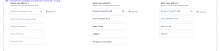
Designed for cross-device accessibility, allowing users to track and process loan applications seamlessly on both desktop and mobile devices.

Usability Testing
Medium Used
-
In-person
-
Remote sessions via Zoom/Google Meet
20
Novice Users
3
Expert Users
I conducted usability testing in two stages:
-
Internal Testing: Initially, I tested the design with design experts within the team to gather first-level feedback before testing it with the users and made fixes.
-
External Testing: After incorporating the feedback, I tested the design with 23 users to identify usability issues and understand user behaviour.
Usability Testing Matrix
To quantify user satisfaction, I used the System Usability Scale (SUS) - a standardized questionnaire consisting of 10 questions to assess the perceived usability of the system.

SUS Score
Grade: Excellent
This indicates that users found the application highly usable, intuitive, and efficient, with minimal friction during the process.
Design Hands off
</>
After the foundational coding, I conducted testing on the design, identified bugs, and listed the necessary changes to fix the issues and improve the overall user experience.
I handed over design document to the team of developer to make sure seamless integration.
Key Learnings
-
Educational markers and accessible support reduce hesitation and improve task completion.
-
Clear navigation simplifies long and complex application workflows.
-
Cross-device design ensures flexibility and continuity in user experience.
-
Visual progress indicators and checklists reduce ambiguity and prevent errors.
-
Early internal testing helps catch usability issues before user testing.
-
A well-structured component library accelerates iteration and ensures consistency.
